
Detailed badges have a demanding job. They may need to combine a title, department or district, specialty, center seal, decorative border, nameplate, and symbolic crest within a piece that fits in the palm of a hand. Color can help organize those elements, but one of the most effective design tools comes from the metal itself: contrast between two finishes.
A two-tone custom metal badge uses differences such as silver and gold tones to separate information, frame important areas, and create depth. The result can feel formal and intricate without requiring a large enamel palette.
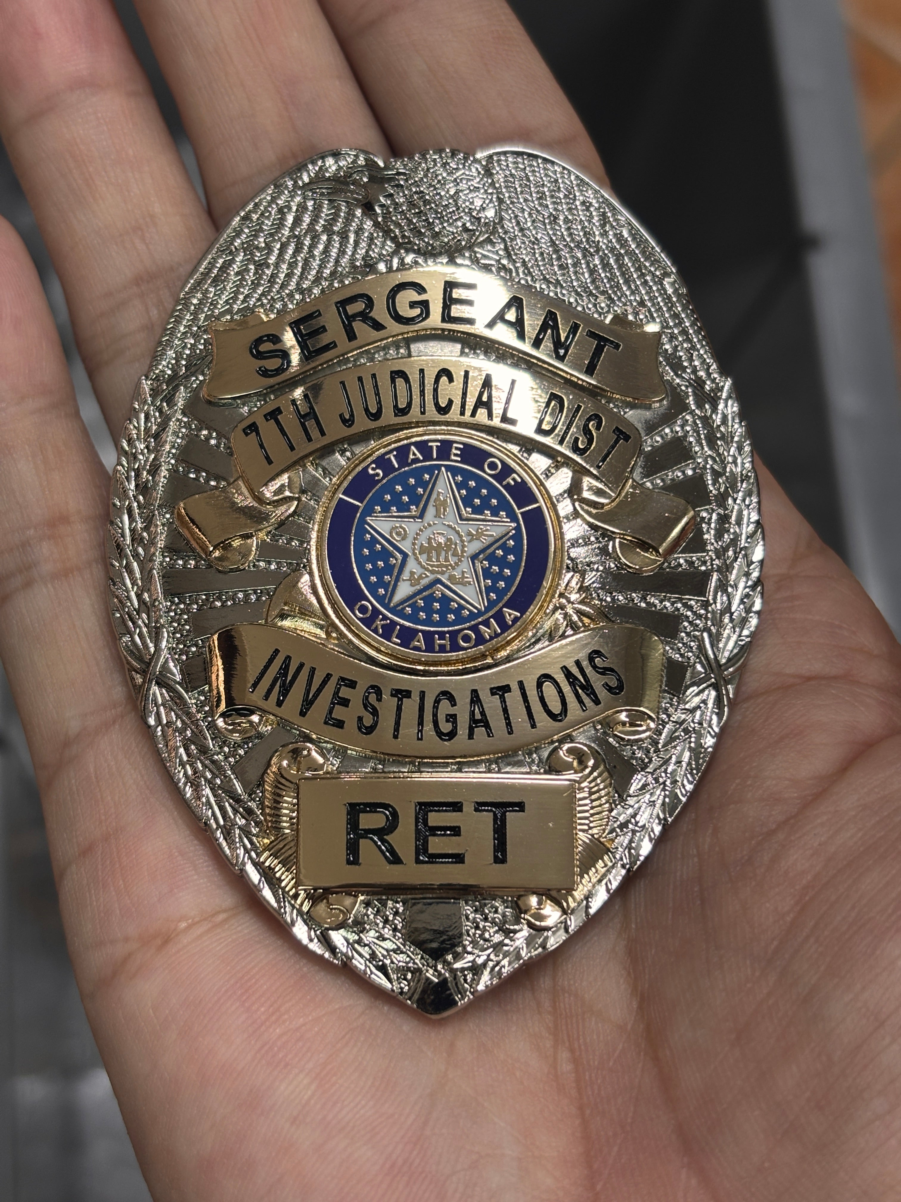
The featured badge illustrates this approach clearly. A silver-tone eagle and textured body form the foundation. Gold-tone banners carry dark lettering, the center seal adds blue enamel, and a lower gold-tone plate creates a dedicated space for personalized text. The finishes do more than decorate the surface—they guide the eye through the design.
Contrast Creates an Information Map
When a badge contains many details, the viewer needs visual cues. A change in metal tone can tell the eye that one section has a different function from the area around it.
On the featured piece, the silver-tone background acts as a frame, while gold-tone banners hold the role, district, specialty, and lower personalization. Because the banners share a consistent finish, they read as one information system even though they appear at different heights. The blue center medallion becomes a third focal layer.
This organization is especially useful when the wording cannot be reduced. Instead of adding extra outlines or colors around every line, the design lets the material contrast establish boundaries naturally.
Use One Finish as the Foundation
A successful two-tone badge usually has a dominant finish. It covers the main silhouette and gives the piece a unified character. The secondary finish can then be reserved for banners, borders, seals, letters, rays, or other areas that deserve emphasis.
The silver-tone body in the featured badge provides a cool, bright base. Its eagle crest, side details, and textured fields remain visually connected. Gold-tone elements are placed on top of that foundation, so the design gains warmth without losing cohesion.
Reversing the relationship would create a different impression. A gold-tone base with silver-tone banners may feel warmer and more traditional, while an antique finish can reduce shine and emphasize recessed details. The best choice depends on the organization's approved style, the badge's purpose, and the level of contrast required.
Combine Texture and Polish
Metal tone is only one part of the visual language. Surface texture can add another level of separation. Polished areas reflect light sharply, while stippled, sandblasted, or patterned fields appear softer and darker from many angles.
The featured design combines bright banner faces with richly textured silver-tone surroundings. Fine lines in the eagle and side ornamentation create dimension, and smoother gold-tone plates make the text easier to locate. Even without enamel in every section, the change from texture to polish helps divide the layout.
When reviewing artwork, decide which surfaces should catch the strongest highlights. Important letters need a stable background, while large empty fields can benefit from texture. Too many highly polished areas may compete with one another in photographs; too much texture can make the badge feel flat. A thoughtful balance creates depth.
Let Lettering Work With the Finish
Dark recessed lettering offers strong contrast against bright metal. In the featured badge, black letters remain readable on the gold-tone banners because the color and surface are clearly separated. The typography is also sized according to the available space: the main title is broad, the district line is slightly smaller, and the specialty has a dedicated banner.
Letter spacing matters as much as letter height. Narrow banners may require a condensed type style, but characters still need enough room to remain distinct after production. Long department names should be tested at actual size rather than judged only on enlarged digital artwork.
If an enamel color is used for lettering, it should contrast with both metal tones. A color that looks strong on gold may appear less distinct against silver, so every placement needs to be reviewed within its final surroundings.
Give the Center Seal Room to Breathe
The center medallion is often the most detailed area of a custom badge. It may contain a state, municipal, organizational, or commemorative emblem with several small colors and symbols. Surrounding it with a clean metal border helps protect its legibility.
Here, the blue circular seal is enclosed by gold-tone rings and positioned against the silver-tone body. That sequence—color, gold, silver—creates a clear edge around the emblem. The medallion feels connected to the rest of the badge without blending into the nearby banners.
If a supplied seal contains very fine details, some simplification may be necessary for metal and enamel production. The goal should be to preserve authorized identifying features while removing lines that cannot reproduce cleanly at the chosen size.
Integrate a Nameplate or Variable Field
Specialized badges may need a surname, unit code, designation, date, or serial-style number. Two-tone construction can make that variable field feel intentional. A plate that matches the other information banners creates consistency and provides a controlled area for changing text.
The lower rectangular plate in the featured design repeats the gold tone and dark lettering used above. Small decorative fastener details visually attach it to the badge. Because the personalization is separated from the center seal and specialty banner, it remains easy to identify.
For orders with multiple unique plates, prepare a verified data list and define character limits in advance. Longer entries may require adjusted spacing, so the shortest and longest examples should both be reviewed before final approval.
Consider Photography and Real-World Lighting
Reflective metal changes with its environment. Silver tones may pick up cool highlights, while gold tones can appear warmer under indoor lighting. Textures may look subtle in diffuse light and more pronounced under a direct light source.
Ask for or create proofs that show both the overall design and the actual-size reading experience. Product photographs should control glare so the lettering and finish contrast remain visible. In person, the badge should still have a clear hierarchy as it moves through different angles.
Prepare an Accurate Two-Tone Badge Brief
Before production, specify:
- The dominant and secondary metal finishes
- Which banners, borders, letters, and decorative fields use each finish
- Areas that should be polished, recessed, or textured
- Exact enamel colors and their locations
- Final dimensions and attachment or display method
- Approved wording, seal artwork, and personalization data
- Authorization for protected logos, seals, titles, or official-style insignia
Any design resembling an official credential should be created and used only for lawful, authorized purposes. Confirm local requirements and obtain permission for organizational marks before ordering.
Use Finish Contrast to Make Detail Feel Effortless
The best detailed badges do not feel crowded. Their visual structure makes complex information seem natural. A dominant metal finish creates unity, a secondary finish highlights key sections, texture adds depth, and carefully planned lettering keeps the message readable.
Mainny's collection of personalized custom-designed badges offers a range of shapes and layouts to consider when planning an authorized design. Use those references to think about finish placement, then prepare your exact wording, artwork, colors, size, and personalization needs.
Interested in a two-tone custom metal badge? Contact Mainny to discuss how finish, texture, enamel, and lettering can work together in your design.