
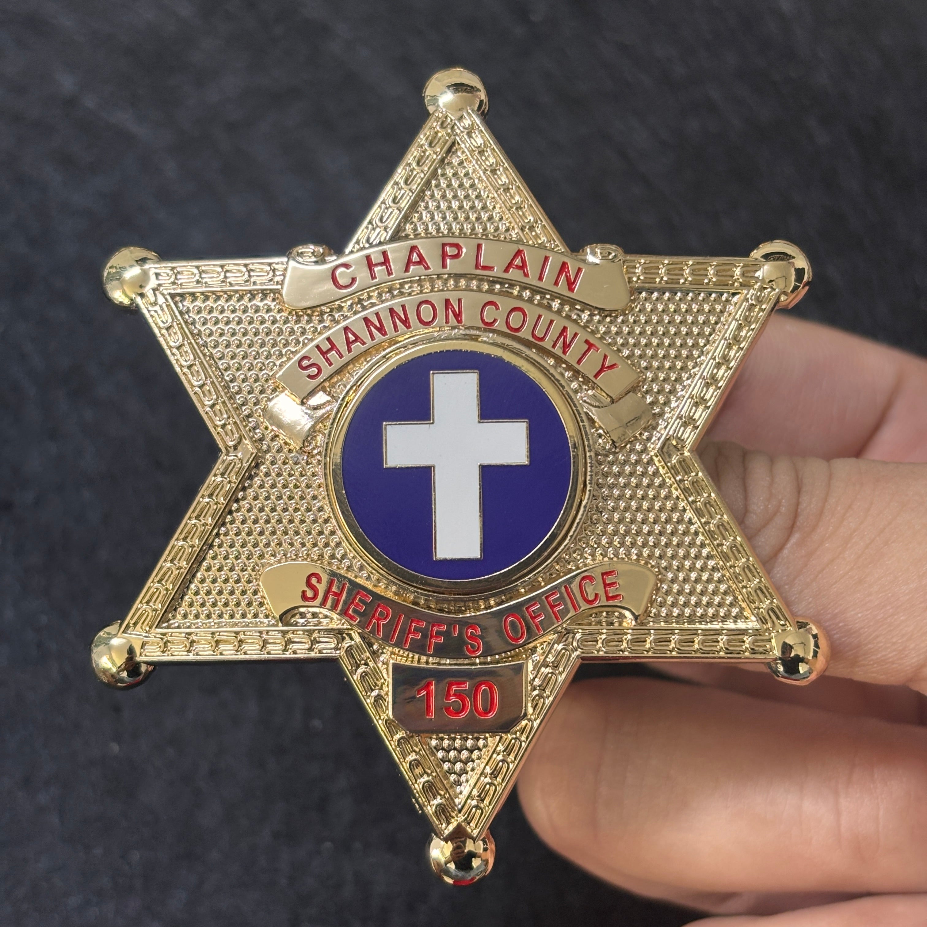
Not every role within an organization carries the same responsibilities, and a well-designed custom metal badge can make that distinction visible. A specialized badge may identify a chaplain, investigator, training officer, event coordinator, safety representative, or another member whose work differs from the broader team. The goal is not simply to add a new title to an existing badge. It is to create a visual identity that communicates the role clearly while still belonging to the same organization.
The featured badge demonstrates how several design choices can work together. Its six-point star silhouette creates an immediate outline. A gold-tone finish gives the piece a formal presence, red lettering makes the role and organization easy to find, and a blue center medallion with a white cross establishes a distinct symbolic focus. A separate number panel completes the layout without crowding the other information.
Start With the Function of the Role
Before choosing a shape or finish, define what the specialized badge needs to communicate. Is the role operational, ceremonial, supportive, administrative, or honorary? Will the badge be worn, displayed, presented as an award, or kept as a commemorative piece?
These questions affect the entire design. A recognition badge may place greater emphasis on a recipient's name or years of service. An organizational role badge may need the title to be the most readable element. A commemorative piece can devote more room to an event date, motto, or symbolic emblem.
In the featured design, the word “CHAPLAIN” receives the most prominent text position. That choice makes the specialized role clear before the viewer reads the county name or identification number. It is a simple example of designing around function: the information that matters most is given the strongest visual priority.
Let the Silhouette Do Some of the Work
A badge is often recognized by its outline before any lettering becomes legible. Stars, shields, ovals, crests, and eagle-topped forms each create a different first impression. The shape can also connect a specialized badge to a larger family of organizational designs.
The six-point star shown here offers six balanced arms and a strong central area for an emblem. Rounded tips soften the geometry, while a patterned border gives the star visual depth. The result is distinctive from a distance but still provides enough interior space for several text bands.
When developing a badge family, consider using a shared silhouette for related roles and changing only selected elements. Alternatively, reserve a unique outline for a specialized position while repeating the same metal finish, border texture, or lettering style used elsewhere. Either method can create both unity and distinction.
Create a Clear Text Hierarchy
Specialized badges often need to display several kinds of information: role, organization, location, unit, name, rank, or number. Trying to make every line equally prominent usually reduces readability.
A better approach is to rank the information before designing. The primary line might be the role. The secondary line could identify the organization or region. A smaller plate can carry an individual number. Font size, banner width, letter spacing, enamel color, and placement can then reflect that order.
Curved banners are useful because they follow the shape of the badge and leave the center open. In the featured piece, the role appears across the upper banner, the county name follows a second arc, and the office name sits beneath the emblem. The number occupies its own lower panel. Every line has a defined place, so the badge remains organized despite containing multiple details.
Use Symbols With Intention and Respect
A central emblem can communicate purpose more quickly than text. Religious symbols, civic seals, occupational icons, community marks, and organizational logos can all become visual anchors. Because symbols may carry legal, cultural, or personal significance, they should be selected carefully and reproduced only with appropriate permission.
The blue-and-white cross medallion in the featured badge creates immediate contrast with the surrounding gold tone and red lettering. Its simple geometry stays recognizable even at a relatively small size. The circular border also separates it from the textured star background, helping the symbol remain visually clear.
When supplying emblem artwork, use the cleanest reference available. Fine lines may need to be simplified for a small metal format, while essential proportions and identifying features should remain intact. Reviewing a proof at the badge's intended physical size is just as important as examining it enlarged on a screen.
Choose Color to Support Recognition
Enamel color can distinguish roles, departments, membership levels, or editions, but it works best in a controlled palette. The featured badge uses red for the main lettering, blue for the emblem field, and white for the central cross. Each color has a purpose, and the broad gold-tone surface prevents the design from becoming visually busy.
For a coordinated series, an organization might keep the same metal finish and emblem while assigning different lettering colors to specialized roles. Another option is to keep all text consistent and change only the center medallion. The system should be simple enough that the difference is easy to recognize and practical to reproduce.
Make Personalization Part of the Layout
A number, name, or date should look planned rather than added after the rest of the design is complete. Dedicated panels are especially effective because they provide a stable area for variable information while protecting the balance of the badge.
The lower number plate on this design is separated from the office banner above it. The number is large, centered, and finished in the same red used for the other lettering. That repetition connects the personalized field to the broader design.
If multiple badges will share one master design, identify all variable fields before production. Confirm the permitted character count, decide how longer names or numbers will fit, and check every data entry carefully. A consistent numbering or naming plan makes the final set feel intentional.
Review the Complete Badge as a System
Before approval, examine how every element works together:
- Can the specialized role be identified quickly?
- Is the organization name readable without competing with the role?
- Does the central emblem remain clear at actual size?
- Are the metal finish, enamel colors, and textures sufficiently distinct?
- Is personalized information placed in a dedicated, balanced area?
- Are spelling, numbering, capitalization, and punctuation correct?
- Has the organization authorized every seal, symbol, title, and insignia used?
Badges that resemble official or public-service credentials must be commissioned, possessed, and used only for lawful, authorized purposes. Buyers should confirm applicable rules in their location and obtain permission for protected marks before production.
Turn a Specialized Role Into a Cohesive Design
A successful specialized badge does two things at once: it makes the role unmistakable and preserves a connection to the larger organization. Shape establishes the first impression, text hierarchy explains the position, a meaningful emblem provides focus, and controlled personalization gives the piece an individual purpose.
To explore shapes and styles that can serve as a starting point, browse Mainny's personalized custom-designed badges. Bring your authorized artwork, exact wording, preferred dimensions, colors, finish, and quantity to the discussion so each decision can support a clear, cohesive result.
Ready to create a badge for a specialized role? Contact Mainny to discuss a personalized metal badge designed around your organization's approved identity and requirements.