
A personalized number may occupy only a small portion of a metal badge, but it can be one of the most important details in the entire design. Whether the field represents an internal identifier, membership number, commemorative edition, employee code, or other authorized reference, it needs to be readable, accurate, and visually connected to the rest of the badge.
Effective numbering is not simply a matter of placing digits wherever space remains. The number should have a defined position, a suitable type size, and enough contrast to be recognized without competing with the title or central emblem.
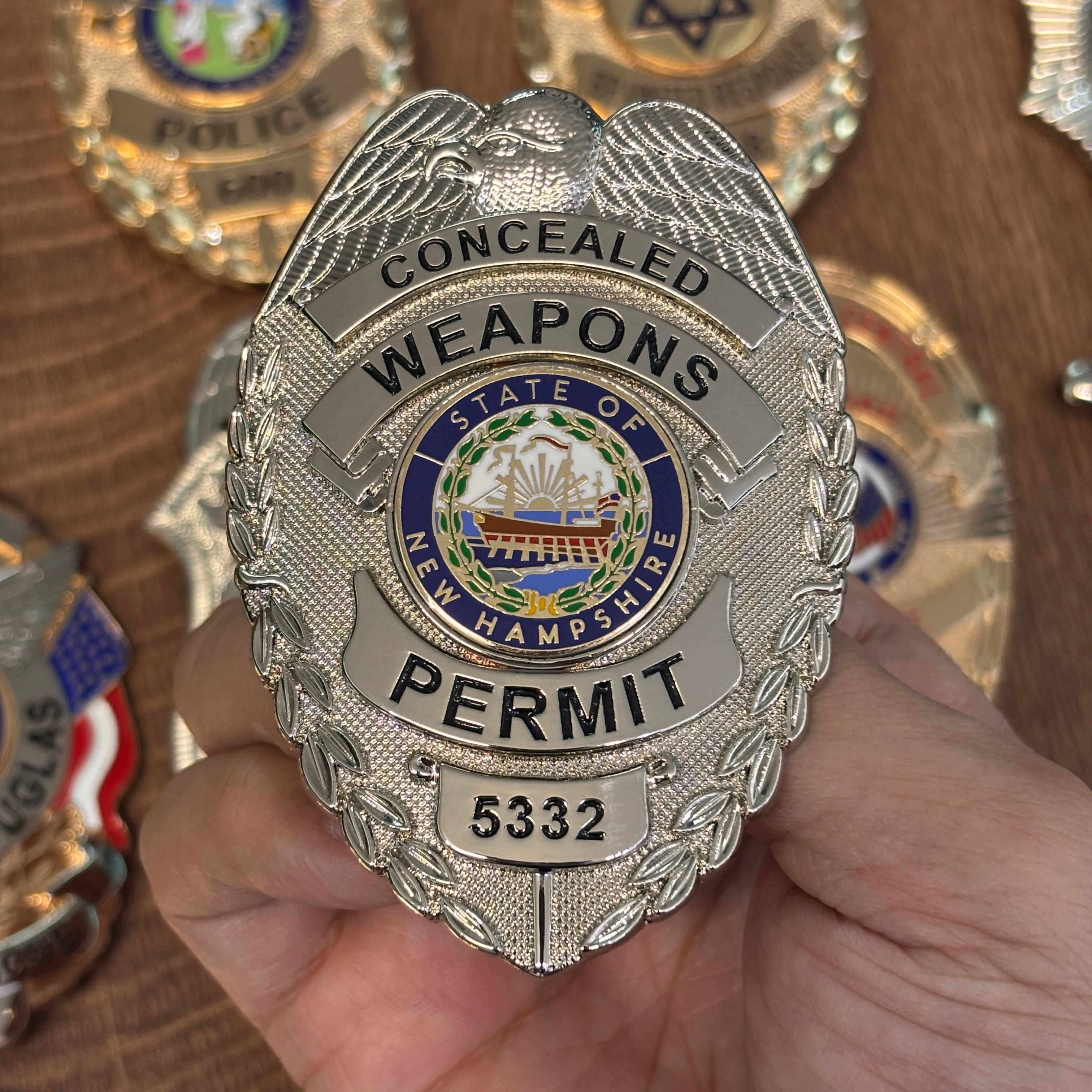
The featured badge provides a useful study in information hierarchy. A silver-tone eagle crest establishes the top of the design. Two curved title bands occupy the upper half, a colorful New Hampshire center seal creates the focal point, a broad role banner appears below, and a separate lower panel holds the number. Each element has a job, and the numbered field feels integrated into the structure.
Decide What the Number Represents
Before designing the panel, define the number's purpose. Is it unique to one individual or item? Does it identify a unit, year, series, office, or membership level? Will the format always use the same number of digits? Could letters, hyphens, or leading zeros appear?
These details affect the width and height of the field. A four-digit sequence can fit differently from a mixed code such as A-104. If the design will be produced as a set, the panel needs to accommodate the longest authorized entry without making shorter entries look awkward.
Create a simple data specification before submitting artwork. State the allowed characters, maximum length, capitalization rules, and whether leading zeros must be preserved. This small step can prevent inconsistent formatting later.
Build the Badge Around a Reading Order
A viewer should be able to understand a badge in stages. The largest title or role normally comes first. The organization or jurisdiction follows. A seal or emblem provides visual identity, and the number supplies individual detail.
The featured design follows a top-to-bottom sequence. The eye begins at the eagle, moves through the upper title bands, arrives at the colored center seal, reads the lower role banner, and finishes at the number panel. Because the number is last in the hierarchy, it can remain prominent without overpowering the main wording.
When sketching a custom badge, list every required element and rank it. If the first draft gives too much space to secondary information, adjust the layout before adding ornamentation. Clear hierarchy makes even a detailed badge easier to scan.
Reserve a Dedicated Number Panel
A separate panel is one of the most reliable ways to present variable information. It creates consistent alignment across multiple badges and gives the digits a clean background.
On the featured piece, the number sits in a rectangular plate below the main banner. The field follows the centerline of the badge and is wide enough to provide comfortable spacing around the four digits. A thin border defines the panel without adding another enamel color.
Panel shape can echo the broader design. Curved plates work well on oval badges, while angular or rectangular fields can provide contrast on shield and eagle-top forms. The number should feel like part of the original architecture, not a label placed over finished artwork.
Use Type Size and Spacing for Real-World Legibility
Artwork is often reviewed at a much larger scale than the finished badge. Digits that appear spacious on a monitor may feel tight when reduced to actual size.
Test the number panel at the intended dimensions. Make sure similar characters remain distinct, especially 1 and 7, 3 and 8, or 0 and O if letters are permitted. Avoid overly thin strokes that may disappear in recessed enamel or very reflective surroundings.
Consistent spacing is also important. Digits should be optically centered rather than pushed toward one edge. If several number lengths are planned, decide whether shorter values will be centered or padded with leading zeros, and apply that rule across the set.
Create Contrast Without Overloading the Design
The number needs contrast, but it does not necessarily need a new color. Dark recessed characters against bright silver- or gold-tone metal can be highly readable. Repeating a lettering color already used elsewhere also helps the numbered field belong to the same system.
The featured badge uses black lettering throughout its main title bands, role banner, and number panel. This consistency allows the colorful center seal to remain the visual focal point. The number is easy to locate because of its dedicated plate, not because it introduces another competing color.
Texture can provide additional contrast. A polished panel surrounded by a stippled field will catch light differently, helping the variable information stand out even when the entire badge uses one metal tone.
Keep the Center Emblem Distinct
A numbered badge may also carry a detailed seal, logo, or emblem. The number and emblem should support different functions: the emblem communicates shared identity, while the number communicates an individual or item-specific reference.
In the featured design, a multicolor circular seal sits at the visual center. Blue, green, white, red, and gold details are contained within a clear border. The number appears below in a neutral metal panel, so the two areas do not compete.
When adapting detailed artwork to metal, review the smallest lines and color separations. Simplification may improve reproduction, but any protected or official mark must be used only with permission and must follow the owner's requirements.
Plan a Master Design for Multiple Numbers
If an organization needs a series of personalized badges, create one approved master layout and identify the variable fields. This makes the shared elements—shape, finish, title, seal, borders, and attachment—consistent across the order.
Then prepare the personalization data in a clean, verified list. Each row should match one badge and include the number exactly as it should appear. Avoid relying on handwritten corrections or informal messages scattered across different channels.
Before full production, review a proof showing both a short entry and the longest entry. Confirm that the number panel stays balanced in each case. If the series will continue in the future, keep a record of the design specifications so later additions can match.
Check Every Detail Before Approval
Use a final review checklist:
- Confirm the purpose and format of the number
- Verify every digit, letter, hyphen, and leading zero
- Check centering and spacing at actual badge size
- Ensure the number contrasts with its background
- Confirm title, role, and organization wording
- Review emblem detail and approved colors
- Specify metal finish, texture, dimensions, and attachment
- Confirm authorization for all names, seals, titles, and official-style elements
Permit-style, public-service, or official-looking badges must never be used to misrepresent authority. They should be ordered, owned, and displayed only for lawful and properly authorized purposes in accordance with applicable local rules.
Turn Numbering Into Part of the Design
The clearest numbered badges treat personalization as a planned design feature. A strong reading order guides the eye, a dedicated panel protects legibility, consistent typography connects the number to the main wording, and an organized data process reduces errors.
To compare potential silhouettes and information layouts, visit Mainny's personalized custom-designed badges. Choose an authorized starting style, then prepare the exact text, number format, emblem artwork, finish, colors, dimensions, and quantity needed for your project.
Ready to plan a numbered custom metal badge? Contact Mainny with your approved design requirements and personalization list to begin the conversation.